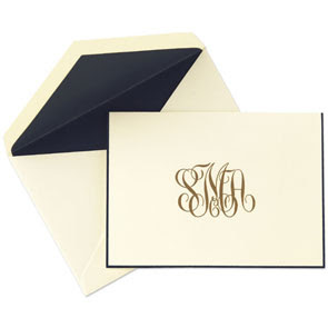
If you've recently attended a dinner party, weekend brunch date, or even just an evening that left such an impression that you feel like a technology thank you is inappropriate, you're probably right. Thank you's via email, text, or ecard, even though you are sending it with the right intentions, can be deemed cold and possibly even rude. Instead, try writing a personable letter to prove just how touched you were by the event. It's classy, tasteful, and shows your graciousness. I found a fantastic article in Allure about how to select the perfect stationery for your taste....here are some tips from William S. Miller, owner of stationery store the "Printery" located in Oyster Bay, New York.
-Know your options
With so many things to consider—color, font, borders, monograms, icons, envelopes—the choices can feel overwhelming, but the best way to get a sense of what you like is to comb through samples. What are you drawn to? Do you like brighter colors or pale paper? Simple fonts or something more elaborate? A century ago, there might have been rules about what personal papers should look like, but today, if it looks good, it is good, and your sensibility should be your guide.
·-Get a feel for it
·-Get a feel for it
Most people like the feel of heavy cotton paper with an eggshell, or smooth, finish. Twenty years ago, everyone ordered letter sheets, but today most people opt for correspondence cards, which are more versatile. They can accommodate a few lines of thanks or even a whole condolence note.
·-Color it in
·-Color it in
When choosing colors, think about how the paper and the lettering will play off each other. A creamy off-white is the most basic—and conservative—choice for paper stock, but I love blues and greens, and we have a tobacco-colored paper that makes the ink on top really pop. Pale gray and silver is another sophisticated combination, as is pale green and copper, or orange and brown. (Make sure metallics don't look like tinfoil; you want them to just catch the light, not reflect it.) I also like a tone-on-tone effect, such as the one you get by pairing two shades of blue.
·-Consider your audience
·-Consider your audience
If the stationery is for professional purposes, I think it's best to use your full name, since a potential client or employer may not recognize your initials. A monogram is both more personal and more old-fashioned. The most classic lettering styles are English Script, Shaded Roman, and a sans-serif Gothic—all three are timeless.
·Finishing touches
·Finishing touches
An envelope should have your return address printed on the flap, and I prefer full words to abbreviations. Use numerals unless the number is ten or less. And if you want them to feel really special, have the envelope lined with tissue in a shade that echoes the rest of your color scheme.


